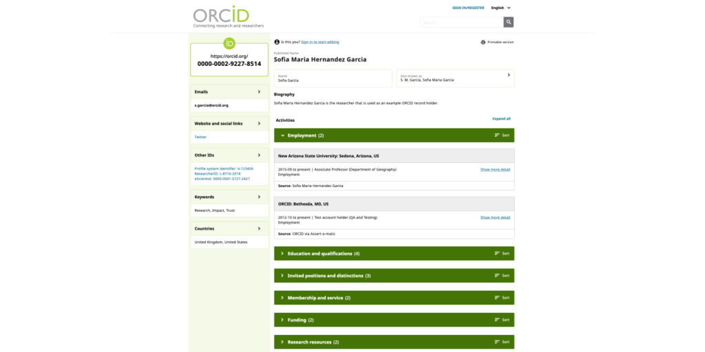
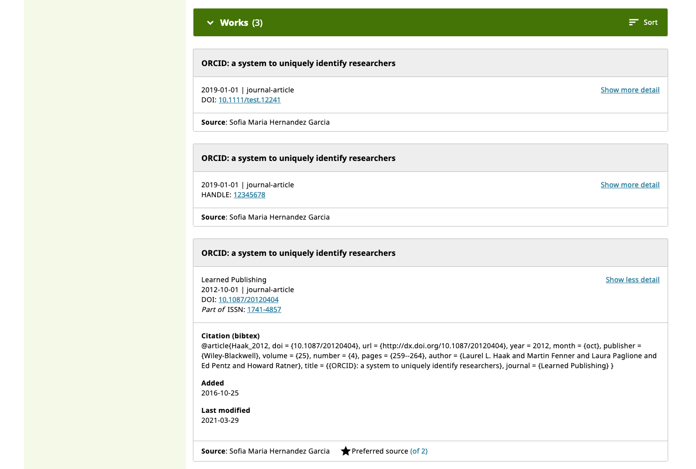
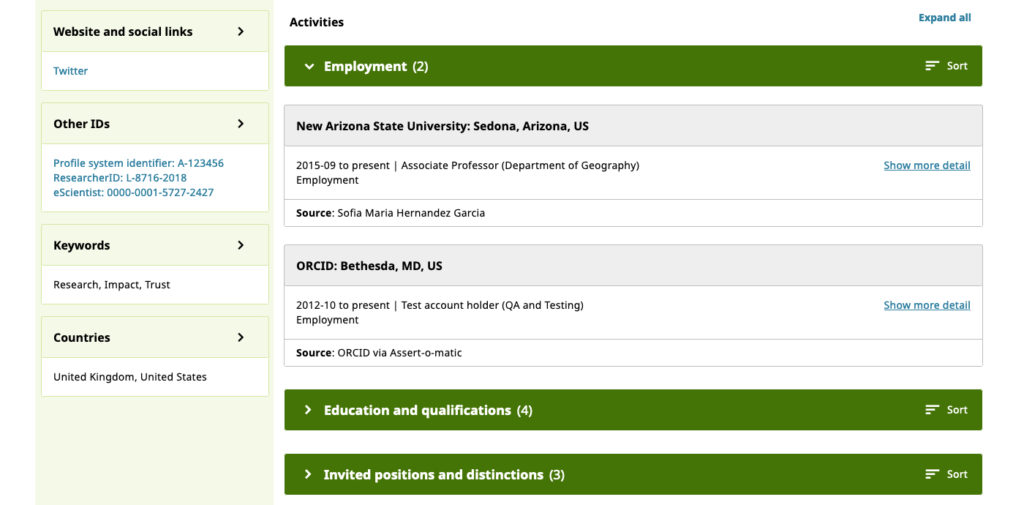
Throughout the past year, we’ve been sharing our progress with you as we migrate the ORCID Registry UI to a faster, more sustainable framework, and most recently we’ve released improvements to notifications and to the ORCID inbox. This has been a prime opportunity for us to evolve the design of our user interface to keep up with changing demands and expectations of users, and we are proud to say that after nearly 10 years of an unchanged user interface, we are now live with an updated look and feel! (Update: read more about the earliest part of our UI history here.)
Evolution, not revolution
This new release centers around the Public page of an ORCID record—the page you land on when you are visiting an ORCID record—and shows clearly the design direction we are heading with for the entire registry. With 10 years of experience under our belts, we have amassed an understanding of our UI’s strengths and weaknesses, and we wanted to keep what worked while modernizing the interface for efficiency, performance, clarity, coherence, and accessibility. This meant maintaining the information density and detail and retaining the familiarity of the page while smoothing out the user journey and improving readability.
While undertaking this work, we kept 5 key principles in mind:
- Accessibility. Remove the barriers to usage for everyone, regardless of ability, technology or situational context.
- Coherency.Consistent patterns and behaviours across the UI; use once and understand.
- Clarity. A clean, clear, simple UI that puts information front and centre. Legibility is key.
- Performance. The registry application should look and feel fast and responsive.
- Efficiency. Repeatable, reusable components and patterns wherever possible.
What has changed in the registry user interface?
Look and feel
We want all users to be able to quickly and easily scan and understand a page when they visit. This meant simplifying the color palette, which improves legibility for all our users and increases color contrast, aiding accessibility and our drive towards our commitment to meet WCAG 2.1 AA criteria. We developed a modern, grid-based layout that adapts to provide the best use of space regardless of the type of device being used (e.g., phone, tablet), we refined the typography and page spacing, and we introduced a clear visual hierarchy to make those information-packed areas feel more spacious and easier to read.

Names
The name section now makes it easy to see what name you go by. We grouped the names together and made the primary name easier to see and to read.
The ORCID iD
The ORCID iD is now a prominent feature—immediately noticeable and clear that this is your ORCID iD.

Sidebar (My ORCID)
We grouped all personal information together in the sidebar, gave prominence to publicly visible emails, and provided clearer delineation to each section and its purpose.

Activities
This is the main body of an ORCID record, and we redesigned it to make it quicker and easier to use—even records with lots of information! We achieved this by making each section more clearly defined, providing the ability to collapse and expand all activity sections at once, and adding visual cues such as clearer icons and consistent design patterns.

Mobile and smaller devices
ORCID began its existence focused on a desktop experience, but much has changed in the last 10 years. In response, we are working on making ORCID a more mobile-friendly experience. We have made some good progress with early improvements for mobile devices and are planning even more in the future.
More to come!
The registry UI is, of course, a work in progress: Next up is a release of the updated “private” record, which is probably the most complicated and involved section of the ORCID record. Your private ORCID record is where you manage your personal information and add affiliations, works, funding, and more. We’ll also be making the editing process smoother and setting the groundwork for more significant updates coming in 2022.
Watch for this all-new private record arriving sometime in late 2021 with updated management and editing features to make your record use faster, easier, and more enjoyable.
We’d love to hear your feedback on the changes we have made so far. Please let us know if you have any comments or suggestions, and look out for the in-page feedback widget when you visit your ORCID record.
