Access the latest ‘virtuous circle’ graphic (and more!) in our Brand Library.
ORCID is a simple concept that can be surprisingly difficult to explain. I know. I’ve been working at it for seven years now. With over 6m users and 1000 members around the world, we rely on our community to help explain what we are, how ORCID works, and why it matters. We need to make it easier for you, too!
We are open infrastructure, built by and for the research community, that enables researchers to distinguish themselves online.
We have used all sorts of infrastructure imagery – roads, bridges, buildings, plumbing – to illustrate how ORCID helps to make connections between pieces of information. We host regular webinars with stakeholders to share real-life examples of ORCID in action (learn more about the next one in What’s New at ORCID?), and this year we are working to create a repository of demonstration videos.
We also created our “circle diagram” to illustrate the how each of our stakeholders – researchers, employers, funders, and publishers – must take action to help build and use this infrastructure for everyone to benefit.
.png)
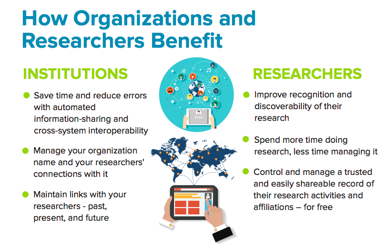
Our new infographic, created in collaboration with IDC, continues our effort to support community understanding of our mission. It provides clear statements of the community needs that drove the founding of ORCID, statistics on how ORCID is being used to make connections between researchers and their contributions and affiliations, and information about the benefits for and impact of ORCID on researchers and organizations. The infographic is available in Chinese, English, French, Portuguese, and Spanish.

Download the PDFs here to use the infographic today — and let us know what you think!
